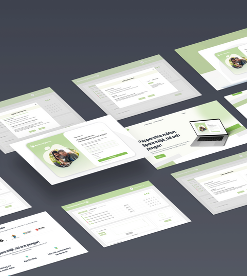
Kommunsignering
Redesign of kommunsignering.se to create a more user-friendly interface for users. The client wanted a new modern design but which does not stand out too much from their other services. The wishes were pure colors that follow today's trends.
SKETCHES
We sketched out three different concepts that we showed to the customer. The idea was that we would get a picture of what type of design attracted them the most. After the meeting, we sifted through and selected the parts the customer liked.
RESEARCH
Following in the users' footsteps and creating an account on kommunsignering.se where we created our own signature routines. We broke down the steps and brought out what was good and what needed improvement.
COMPETITOR ANALYSIS
Competitor analysis was done to see what the market looked like and to identify how the competitors' services were structured and what their interface looked like.
USER TESTS
We did user tests on our prototypes on people in the target group. After each test, we chose to iterate between the tests.Some of the insights we gained were:
- Steps 1-3 must be clarified. The test subjects wanted to receive a response when a step was completed to clarify the steps.
- Some symbols were unclear.
- Some buttons were unclear.
- After the first round of tests, we realized that we needed to create more space for steps 1-3 the steps after a meeting with the customer, to make room for text.
SOLUTION
- Dashboard format: to create a simple and modern flow for users, with everything gathered in one place.
- Clean: coloring, clean look, minimalist look, balanced iconography and balanced amount of whitespace.
- Color palette: Based on Kommunisignering's basic colors but added clean modern colorsIcons: Added icons to simplify flow for users.
- Buttons: Modern buttons with rounded corners and more modern colors.
- Removed: redundant text and created icons for the text.
- Font: changed to a modern font and idiom.
Role: UX designer
Team: Katya Nesterenko
Client: Styrelsemöte.se
Employment: Sustainit
Time: 4 weeks
Tools: Figma, Miro
